Body
Key Functions
- Ability to View, Add, Edit and Delete templates.
User Flow
Ability to View, Add, Edit and Delete Digitize d templates
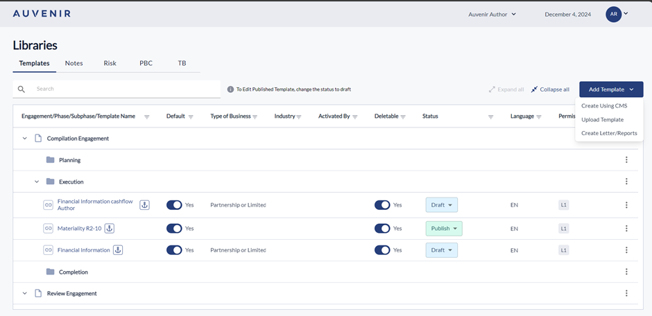
- In the Template Library, locate the "Add Template" button on the right side containing three options “Create using CMS”, “Upload Template” and “Create Letters/Reports”.
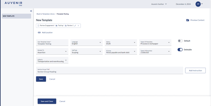
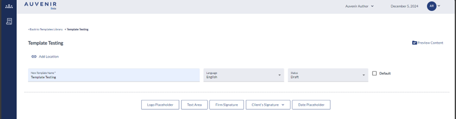
- By clicking on Create using CMS option, new screen will appear as CMS Template editor. There should be a "Back to Template Library" hyperlink, New Template", "Preview content" option.
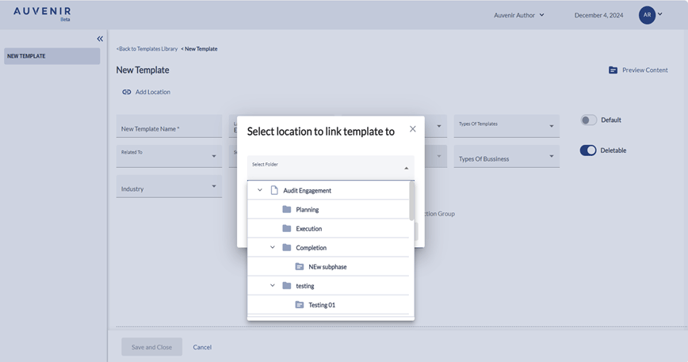
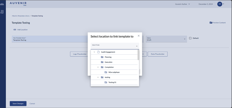
- Below this hyperlink, there should be a "New Template" header and “Add location” option. User can link the new template to any phases like compilation, Review or Audit engagement with the respective sub-phases like Planning, Execution and Completion.
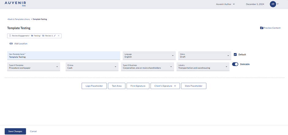
- On clicking "New template name" user can provide the template name, and dropdowns are available for selecting "language" and "status”, “Type of Template”, “Related to” “Subtype” "FS Area” "Type of Business” and "Industry” as per the requirement. There is toggle to activate the template as a default template which will be available as default when it gets published. Deletable toggle helps the user to make the template deletable by default.
- The "Type of Business" is a multi-select dropdown list, which will enable the user to select the appropriate “type of business” for each template. The drop-down contains the options like “Partnership or limited liability company,” “Non-profit organization,” “Sole proprietorship,” “Corporation, one or more shareholders,” “Small business corporation, two or more owners”, “Limited Liability,” “charitable organization” and “others.”
- The “Industry” is a multi-select dropdown list, which will enable the user to select the appropriate “industry” depending on the template. Clicking the opens a dialog box showing the connected industries like Construction, Manufacturing, Wholesale trade etc associated with the template
- The "Deletable" column has a toggle for yes and no.
- The "Status" column has a dropdown with three options: "published," "draft," or "inactiv” “Published” option enables the template to be available with an anchor tag for All Firms or user selected firms”. “Draft” status basically means the document is currently being edited and will enable the user to create/edit the template. By default, the template will be in “draft” mode. While selecting “Inactive” option the template will be inactive and cannot be used in any firm.
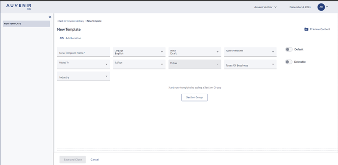
Section Group
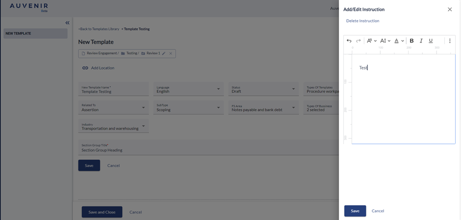
- Click the "Section Group" button to open a text field for the section group title and an "Add Instruction" button.
- User can enter the Section group heading in this section.
- Click on the "Add Instruction" button to open a dialog box. In the dialog box, user can add the required instructions. On clicking the save button, the provided instruction will visible besides the Section heading. User is able edit the provided instruction by clicking on the edit instruction button.
- On clicking on the save button the text and instruction entered will get saved and below the section, following buttons will be available: "Section group," "Guidance," "Question," "Table," "Attachment," "Reference," and "Widgets".
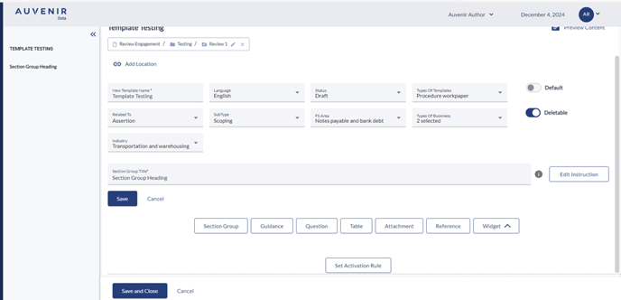
- To the right of the "New Template" header, there will be a "Preview content" button to preview the template within the application.
Guidance
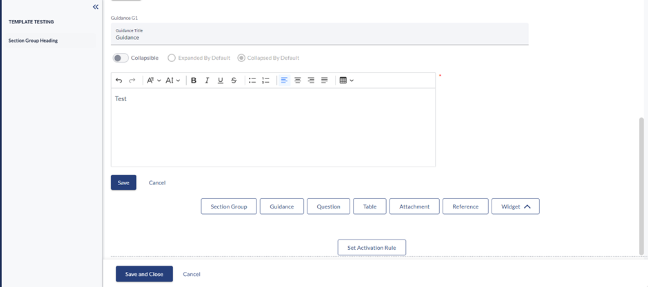
- Within a template, user can add a guidance section from various selectable options. Clicking the guidance button presents a Text Box to enter the guidance title.
- User can toggle on or off the radio button to Collapse, expanded by default and collapsed by default the content as per requirement.
- User can use the rich text editor to type the guidance text they wish to add.
- By clicking on the save button user can save the data entered in text box and by clicking on cancel button user can cancels the process of adding guidance text.
- Each guidance section will have a unique ID starting with G1 (e.g., Guidance G1, Guidance G2, etc.), displayed at the top of each guidance text.
Questions
User should be able add and customize question sections within the CMS Template Editor.
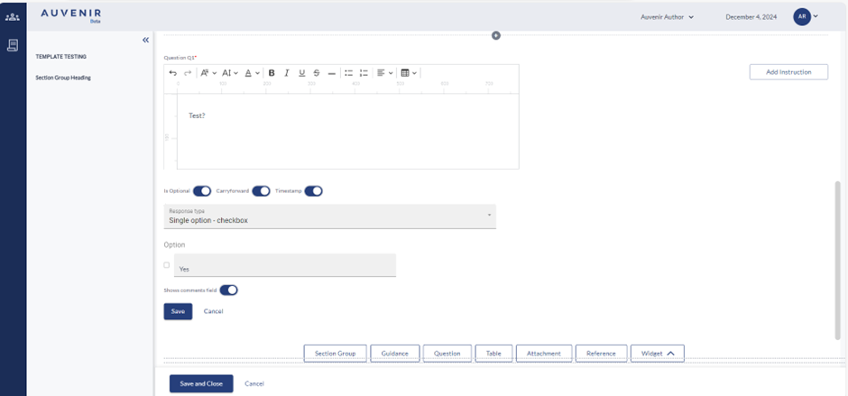
- On clicking the question button user can add the text in the text box and can add instructions by clicking on the instruction button as same as in Section group.
- For the toggle “Is optional" - By default it is toggled off, which means it is mandatory for the end user to answer this question. When turned on, this becomes an optional field for the end user.
- By default, "Carry forward" is turned on, which means this section will get carry forwarded when engagement is carry forwarded and when turned off, this section will not be carried forward for future.
- User can be able to choose the appropriate "response type." From the multiple options. Response type dropdown contains the option like Single option – Checkbox, Single select - radios vertical, Single select – dropdown, Multi - select vertical, calendar date, Number integer, Number percentage, Text simple, Text complex, Text memo and Referencing response.
- For each response type, there will be “Show comments field” toggle, allowing the user to determine if a comment field will require for that section. If toggled on, a comment box will be displayed for that section.
- User can use cancel and save buttons, to save changes to the edits made or cancel the process.
- When saved, the user will see a preview of the question they just made.
Table
Within a template, there is an option to add a table section out of the various selectable section options.
- Users can add table heading and instruction button which have the same functionality as it does in the Add section group, guidance, question etc
- “Number of columns" and "number of rows," which allow the user to define the number of columns and rows for the table. Based on this, table gets generated on-screen
- In addition, template author can also define if end users can add columns and/or rows using the options: "Allow users to add columns" and "Allow users to add rows" respectively.
- One key feature includes providing capability to define properties for each or multiple cells of the table. There is a text stating, "select cells to define," and to the right, a greyed-out "cell properties" button will be available.
- When the user clicks on "cell properties," a popup window appears with two radio button options: "question type" and "response type."
- When the user clicks on "question type," the selected cells is defined to be a question type and will open a rich text editor for the user to type in the question.
- User is able to choose the required option from the "response type."
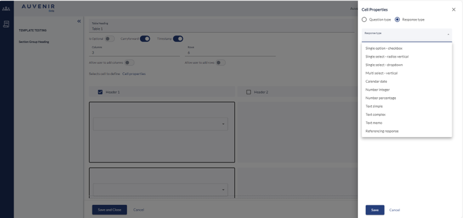
- User can “Add info instruction" allowing the user to enter tooltip content for the selected cell/cells. The user also has ability to Delete the info added.
- Clicking "save" will input the content (either question or response) into the selected cells from earlier.
- Below the cells is a "show comment field" toggle to toggle whether to show the comment field for the end user. By default, it turned off.
- Below all of this is the save and cancel button.
- Clicking "save" will save the changes and show a preview of the section.
Attachments
Users can add an attachment section out of the various selectable section options.
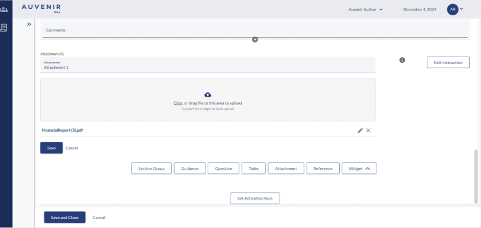
- On clicking the “attachment button”, a text box appears, which is to title the attachment section.
- Users can add attachment heading and instruction button which have the same functionality as it does in the Add section group, guidance, question etc
- User can click or drag files to upload.
- When the user uploads any files, the files appear below the file upload box.
- The user can edit the file names or delete the files that just uploaded.
- Below all of this are the save and cancel buttons.
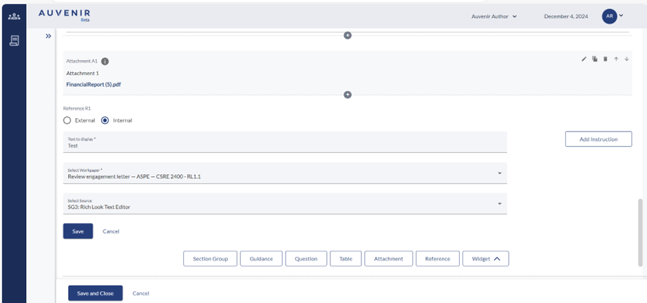
Reference
Users can add an attachment section out of the various selectable section options.
- When the user clicks on the reference button, at the top are two radio buttons: "external" and "internal," with external selected by default.
- If the user selects internal, there are three input fields: the first one is the text to display for the reference, the second one is a dropdown to select a working paper, and the third dropdown is to select the source for the reference.
- If the user selects external, there will instead be two input fields: text to display and a URL field.
- To the right of the input fields is the "Add Instruction" button, which has the same functionality as it does in the section group, guidance, question etc.
- Below the input fields are the save and cancel buttons.
- Clicking save saves the reference and shows the preview of the reference.
- Each reference has its own ID, starting with "Reference R1," and counting upwards.
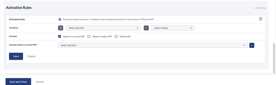
Set activation rules
Users can provide activation rules for a workpaper, and this feature is present at the end of each workpaper/template within the CMS Template Editor.
- At the bottom of the editor, there will be a button called "Set Activation Rules."
- Clicking this button opens a dialog box titled "Activation Rules" with an "Add Rule" button to the right.
- For Activation Rule Row, it Contains info text: "Activation Rule can have 1 condition and multiple Activations in the same or different WP." Trash icon is visible to delete the current activation rule.
- In conditions It contains two dropdowns: "Select Section" and "Select Value." Presented as an if-equals statement: "if 'select section' is 'select value', then..." Conditions are always set for the current template/workpaper.
- In Activate the condition row are three checkboxes: "Section in Current WP," "Section in Other WP," and "Whole WP." At least one checkbox must be checked, resulting in additional rows for the rules.
- In Activation Rows - Section in Current WP: Dropdown to select the section to activate. section in Other WP: Two dropdowns to select WP and the section to activate. Whole WP: Dropdown to select an entire WP to activate.
- User can add multiple rows by clicking on the plus icon of the same activation rule.
- On clicking on the Minus icon user can remove newly added rows if needed
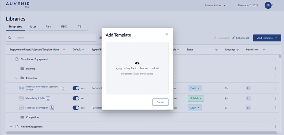
Ability to View, Add, Edit and Delete non-digitized templates
- “Upload Template” will allow the users to upload a template from the user's computer either you can click and browse otherwise you can drag the template.
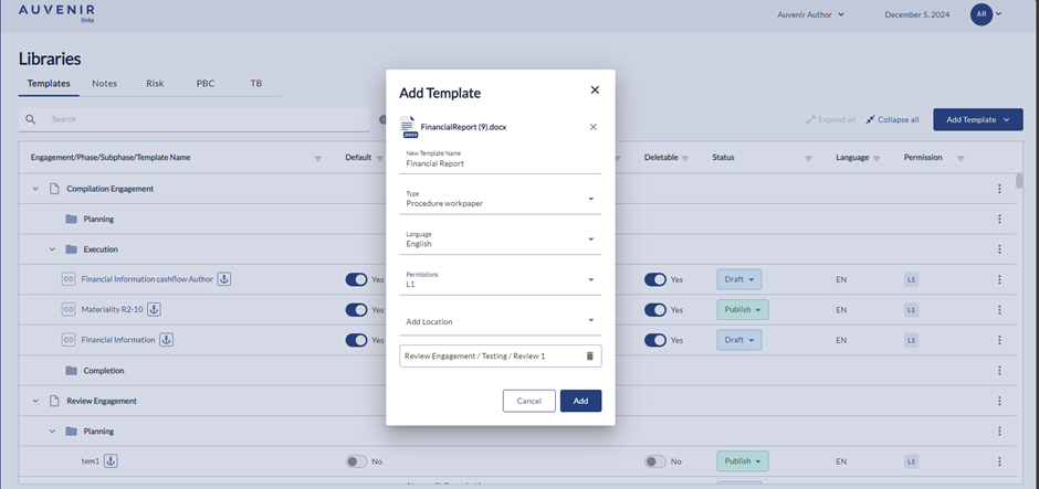
- Once user select the template a pop will come where we need to update “New Template Name”, “Type”, “language”, “Permissions” and option for adding “Location” then user can click on “Add”.
- Users should not be able to make on-screen edits to these templates. When incorporated into an engagement, non-digitized templates do not offer a preview on the screen but appear as attachments instead.
- Users should be able to download these non-digitized templates, edit them as needed, and then upload them back into the application, ensuring even non-digitized templates can be customized and effectively used.
Ability to View, Add, Edit and Delete Letters/reports
- By clicking on “Create Letters/Reports”, a new screen will appear with “Back to Template Library" hyperlink, New Template", "Preview content" option. On clicking "New template name" user can provide the template name, and dropdowns are available for selecting "language" and "status”.
- When the user clicks on the “Default” check box will display the options “Type of Template”, “Related to” “Subtype” "FS Area” "Type of Business” and "Industry” which can be select as per the requirement.
- Below the hyperlink, there should be a "New Template" header and “Add location” User can link the new template to any phases like compilation, Review or Audit engagement with the respective sub-phases like Planning, Execution and Completion.
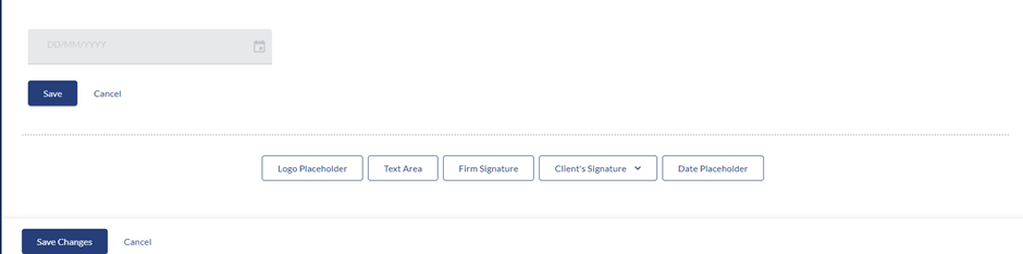
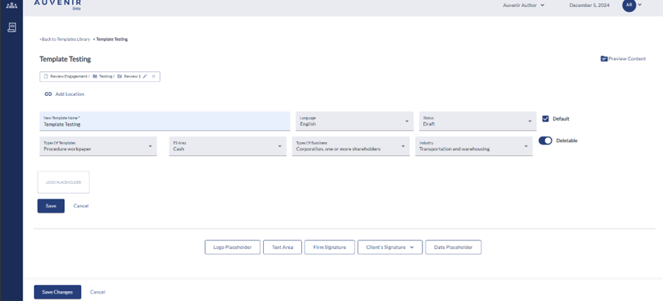
- User can add “Logo Placeholder” which will help the user to display the Firm logo in the respective engagements. Users can use the functionalities like save, cancel, edit, and rearrange as per their requirement.
- User can add “Text area” which will help the user to enter the data which will reflect in the respective engagements. Users can use the functionalities like save, cancel, edit, and rearrange as per their requirement. User is also able to insert TB inside the engagement.
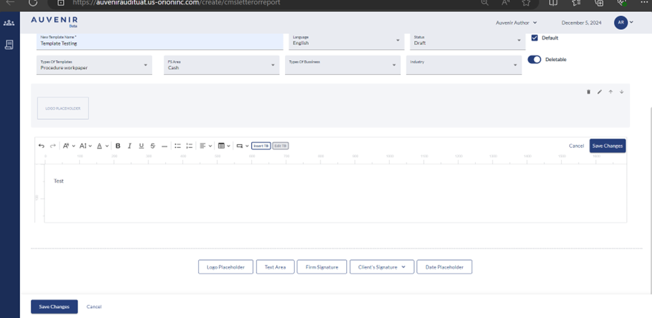
- User can add “Firm Signature “in the template which will reflect in template when the User logged in and directed to active engagement screen. Users can use the functionalities like save, cancel, edit, and rearrange as per their requirement. CMS author can only add one firm signature component per document. Signature will be enabled after the document is marked as completed
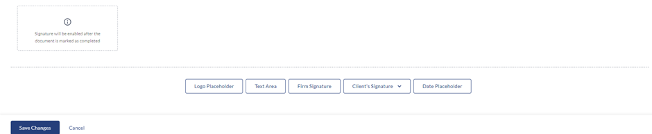
- Users can add "Client Signature" to the template, allowing clients to sign once their verification is complete for the respective engagement. Users can choose either a horizontal or vertical signature format.
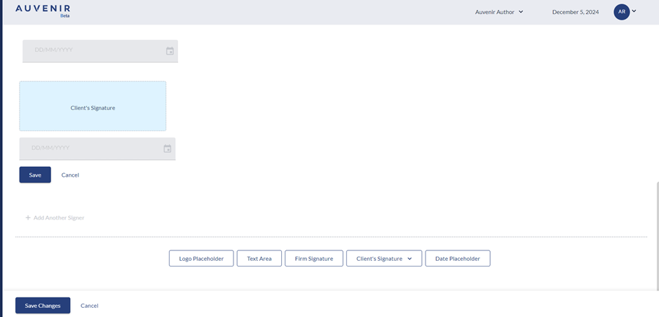
- Users can add “Date Placeholder” to which will display the date inside the active engagement.